Responsive Design Core Concepts
Responsive design fixes this problem!
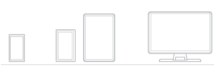
The diagram above is a simplistic view of each device. A traditional smart phone, a large screen smart phone, a tablet and a laptop/desktop. Within each device there are even more resolution differences. With the magic of stylesheets (css) and mobile css frameworks like Bootstrap, we're able to account for each of these major screen sizes while providing a positive user experience with just one code base! This is a huge victory for any business because maintaining multiple websites for each device would be very costly and very frustrating.
Breakpoints
As shown above, there are really three categories of devices we want to support for a friendly experience on a mobile device, tablet or traditional computer. The stylesheet or css is the secret sauce. Using what are known as media queries, the web browser is able to determine the capabilities of the device, especially screen resolution. If you're reading this from a traditional computer, resize your browser now and notice how our mobile friendly website responds as the screen gets larger or smaller.
Scaling Media
A number of the responsive frameworks handle scaling images and videos for you by applying responsive tags around the media. Without a responsive framework, this can still be accomplished with relative ease with css.
img {
    width: 100%;
    height: auto;
}
Applying this simple style to your image tag will scale the image to look good on each device. If you're on a desktop or laptop, resize your web browser and notice the image above is
resizing. Our designers have used the popular Boostrap framework and applied the img-responsive class.